

Data Science Project: Visualizing The Gender Gap In College Degrees
Introduction
The Department of Education Statistics releases a data set annually containing the percentage of bachelor’s degrees granted to women from 1970 to 2012. The data set is broken up into 17 categories of degrees, with each column as a separate category.
Randal Olson, a data scientist at University of Pennsylvania, has cleaned the data set and made it available on his personal website. Randal compiled this data set to explore the gender gap in STEM fields, which stands for science, technology, engineering, and mathematics. This gap is reported on often in the news and not everyone agrees that there is a gap.
In this project, we’ll explore how we can communicate the nuanced narrative of gender gap using effective data visualization using Pandas and Matplotlib.
Year vs Degree Visualization
Let’s start the analyzation by generating a standard matplotlib plot using a simple line chart that visualizes the historical percentage of Biology degrees awarded to women:
%matplotlib inline
import pandas as pd
import matplotlib.pyplot as plt

women_degrees = pd.read_csv('percent-bachelors-degrees-women-usa.csv')
plt.plot(women_degrees['Year'], women_degrees['Biology'],
         c='blue', label='Women')
plt.legend(loc='upper left')
plt.title('Percentage of Biology Degrees Awarded By Gender')
plt.show()
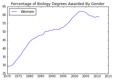
From the plot, we can tell that Biology degrees increased steadily from 1970 and peaked in the early 2000’s. We can also tell that the percentage has stayed above 50% since around 1987. While it’s helpful to visualize the trend of Biology degrees awarded to women, it only tells half the story. If we want the gender gap to be apparent and emphasized in the plot, we need a visual analogy to the difference in the percentages between the genders.
If we visualize the trend of Biology degrees awarded to men on the same plot, a viewer can observe the space between the lines for each gender. We can calculate the percentages of Biology degrees awarded to men by subtracting each value in the Biology column from 100. Once we have the male percentages, we can generate two line charts as part of the same diagram.
Let’s now create a diagram containing both the line charts we just described.
fig, ax = plt.subplots()
ax.plot(women_degrees['Year'], women_degrees['Biology'], label='Women')
ax.plot(women_degrees['Year'], 100-women_degrees['Biology'], label='Men')

ax.tick_params(bottom="off", top="off", left="off", right="off")
ax.set_title('Percentage of Biology Degrees Awarded By Gender')
ax.legend(loc="upper right")

plt.show()
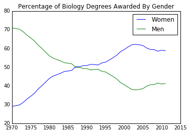
The chart containing both line charts tells a more complete story than the one containing just the line chart that visualized just the women percentages. This plot instead tells the story of two distinct periods. In the first period, from 1970 to around 1987, women were a minority when it came to majoring in Biology while in the second period, from around 1987 to around 2012, women became a majority. You can see the point where women overtook men where the lines intersect. While a viewer could have reached the same conclusions using the individual line chart of just the women percentages, it would have required more effort and mental processing on their part.
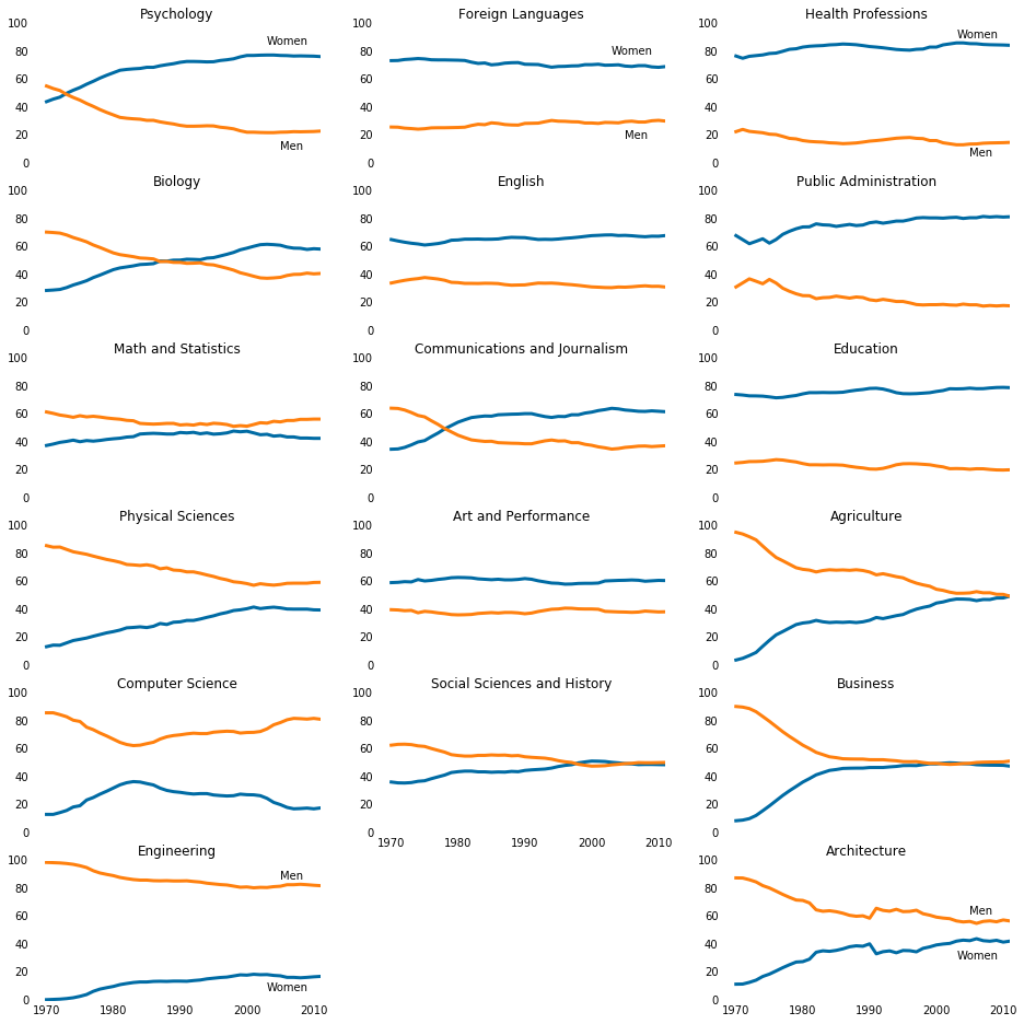
Let’s generate charts to compare multiple degree categories in line charts for four STEM degree categories on a grid to encourage comparison.
stem_cats = ['Engineering', 'Computer Science', 'Psychology', 'Biology', 'Physical Sciences', 'Math and Statistics']
cb_dark_blue = (0/255,107/255,164/255)
cb_orange = (255/255,128/255,14/255)
fig = plt.figure(figsize=(18, 3))

for sp in range(0,6):
    ax = fig.add_subplot(1,6,sp+1)
    ax.plot(women_degrees['Year'], women_degrees[stem_cats[sp]], c=cb_dark_blue, label='Women', linewidth=3)
    ax.plot(women_degrees['Year'], 100-women_degrees[stem_cats[sp]], c=cb_orange, label='Men', linewidth=3)
    for key, spine in ax.spines.items():
        spine.set_visible(False)
    ax.set_xlim(1968, 2011)
    ax.set_ylim(0, 100)
    ax.set_title(stem_cats[sp])
    ax.tick_params(bottom='off', top='off', left='off', right='off')
    if sp==0:
        ax.text(2005, 87, "Men")
        ax.text(2002, 8, "Women")
    elif sp == 5:
        ax.text(2005, 62, "Men")
        ax.text(2001, 35, "Women")

plt.show()
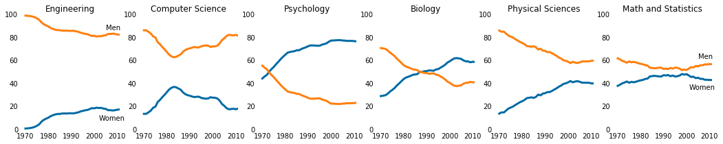
By spending just a few seconds reading the chart, we can conclude that the gender gap in Computer Science and Engineering have big gender gaps while the gap in Biology and Math and Statistics is quite small. In addition, the first two degree categories are dominated by men while the latter degree categories are much more balanced.
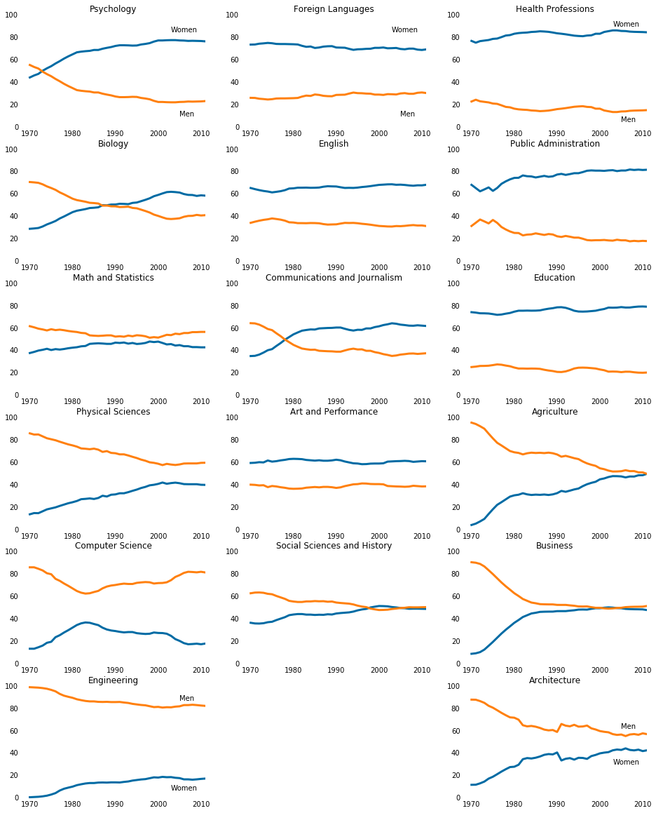
Comparing across all degree categories
So far, we mostly focused on the STEM degrees but now we will generate line charts to compare across all seventeen degree categories. We will group the degrees into STEM, liberal arts, and other listin the following way:
- stem_cats = [
'Psychology','Biology','Math and Statistics','Physical Sciences','Computer Science','Engineering'] - lib_arts_cats = [
'Foreign Languages','English','Communications and Journalism','Art and Performance','Social Sciences and History'] - other_cats = [
'Health Professions','Public Administration','Education','Agriculture','Business','Architecture']
Previuosly, the stem_cats list was ordered by ending gender gap, all three of these lists will be ordered in descending order by the percentage of degrees awarded to women.
stem_cats = ['Psychology', 'Biology', 'Math and Statistics', 'Physical Sciences', 'Computer Science', 'Engineering']
lib_arts_cats = ['Foreign Languages', 'English', 'Communications and Journalism', 'Art and Performance', 'Social Sciences and History']
other_cats = ['Health Professions', 'Public Administration', 'Education', 'Agriculture','Business', 'Architecture']

fig = plt.figure(figsize=(16, 20))

## Generate first column of line charts. STEM degrees.
for sp in range(0, 18, 3):
    cat_index = int(sp/3)
    ax = fig.add_subplot(6, 3, sp+1)
    ax.plot(women_degrees["Year"], women_degrees[stem_cats[cat_index]], c = cb_dark_blue, label='Women', linewidth=3)
    ax.plot(women_degrees["Year"], 100 - women_degrees[stem_cats[cat_index]], c = cb_orange, label='Men', linewidth=3)
    for key, spine in ax.spines.items():
        spine.set_visible(False)
    ax.set_xlim(1968, 2011)
    ax.set_ylim(0,100)
    ax.set_title(stem_cats[cat_index])
    ax.tick_params(bottom="off", top="off", left="off", right="off")

    if cat_index == 0:
        ax.text(2003, 85, "Women")
        ax.text(2005, 10, 'Men')
    elif cat_index == 5:
        ax.text(2005, 87, 'Men')
        ax.text(2003, 7, 'Women')

## Generate second column of line charts. Liberal arts degrees.
for sp in range(1,16,3):
    cat_index = int((sp-1)/3)
    ax = fig.add_subplot(6,3,sp+1)
    ax.plot(women_degrees['Year'], women_degrees[lib_arts_cats[cat_index]], c=cb_dark_blue, label='Women', linewidth=3)
    ax.plot(women_degrees['Year'], 100-women_degrees[lib_arts_cats[cat_index]], c=cb_orange, label='Men', linewidth=3)

    for key,spine in ax.spines.items():
        spine.set_visible(False)
    ax.set_xlim(1968, 2011)
    ax.set_ylim(0,100)
    ax.set_title(lib_arts_cats[cat_index])
    ax.tick_params(bottom="off", top="off", left="off", right="off")


    if cat_index == 0:
        ax.text(2003, 85, "Women")
        ax.text(2005, 10, 'Men')
## Generate third column of line charts. Other degrees.
for sp in range(2,20,3):
    cat_index = int((sp-2)/3)
    ax = fig.add_subplot(6,3,sp+1)
    ax.plot(women_degrees['Year'], women_degrees[other_cats[cat_index]], c=cb_dark_blue, label='Women', linewidth=3)
    ax.plot(women_degrees['Year'], 100-women_degrees[other_cats[cat_index]], c=cb_orange, label='Men', linewidth=3)
    for key,spine in ax.spines.items():
        spine.set_visible(False)
    ax.set_xlim(1968, 2011)
    ax.set_ylim(0,100)
    ax.set_title(other_cats[cat_index])
    ax.tick_params(bottom="off", top="off", left="off", right="off")

    if cat_index == 0:
        ax.text(2003, 90, 'Women')
        ax.text(2005, 5, 'Men')
    elif cat_index == 5:
        ax.text(2005, 62, 'Men')
        ax.text(2003, 30, 'Women')

plt.show()
Axis Adjustments for clean visual representation
With seventeen line charts in one diagram, the non-data elements quickly clutter the field of view. The most immediate issue that sticks out is the titles of some line charts overlapping with the x-axis labels for the line chart above it. Let’s remove the x-axis labels for every line chart in a column except for the bottom most one to find out what degree each line chart refers to.
fig =plt.figure(figsize=(16, 16))

## Generate first column of line charts. STEM degrees.
for sp in range(0, 18, 3):
    cat_index = int(sp/3)
    ax = fig.add_subplot(6, 3, sp+1)
    ax.plot(women_degrees["Year"], women_degrees[stem_cats[cat_index]], c=cb_dark_blue, label = "Women", linewidth = 3)
    ax.plot(women_degrees["Year"], 100-women_degrees[stem_cats[cat_index]], c=cb_orange, label="Men", linewidth = 3)

    for key, spine in ax.spines.items():
        spine.set_visible(False)
    ax.set_xlim(1968, 2011)
    ax.set_ylim(0, 100)
    ax.set_title(stem_cats[cat_index])
    ax.tick_params(top="off", bottom="off", left="off", right="off",labelbottom="off")

    if cat_index==0:
        ax.text(2003, 85, "Women")
        ax.text(2005,10, "Men")
    elif cat_index==5:
        ax.text(2003,7, "Women")
        ax.text(2005,87, "Men")
        ax.tick_params(labelbottom="on")

## Generate second column of line charts. Liberal arts degrees.
for sp in range(1,16,3):
    cat_index = int((sp-1)/3)
    ax = fig.add_subplot(6,3,sp+1)
    ax.plot(women_degrees['Year'], women_degrees[lib_arts_cats[cat_index]], c=cb_dark_blue, label='Women', linewidth=3)
    ax.plot(women_degrees['Year'], 100-women_degrees[lib_arts_cats[cat_index]], c=cb_orange, label='Men', linewidth=3)
    for key,spine in ax.spines.items():
        spine.set_visible(False)
    ax.set_xlim(1968, 2011)
    ax.set_ylim(0,100)
    ax.set_title(lib_arts_cats[cat_index])
    ax.tick_params(bottom="off", top="off", left="off", right="off", labelbottom='off')

    if cat_index == 0:
        ax.text(2003, 78, 'Women')
        ax.text(2005, 18, 'Men')
    elif cat_index == 4:
        ax.tick_params(labelbottom='on')

## Generate third column of line charts. Other degrees.
for sp in range (2,20,3 ):
    cat_index=int((sp-2)/3)
    ax = fig.add_subplot(6,3,sp+1)
    ax.plot(women_degrees['Year'], women_degrees[other_cats[cat_index]], c=cb_dark_blue, label = 'Women', linewidth = 3)
    ax.plot(women_degrees['Year'], 100-women_degrees[other_cats[cat_index]], c=cb_orange, label = 'Men', linewidth = 3)

    for key, spine in ax.spines.items():
        spine.set_visible(False)

    ax.set_xlim(1968, 2011)
    ax.set_ylim(0,100)
    ax.set_title(other_cats[cat_index])
    ax.tick_params(bottom="off", top="off", left="off", right="off", labelbottom='off')

    if cat_index==0:
        ax.text(2003, 90, 'Women')
        ax.text(2005, 5, 'Men')
    elif cat_index==5:
        ax.text(2005, 62, 'Men')
        ax.text(2003, 30, 'Women')
        ax.tick_params(labelbottom='on')

plt.show()
Y-axis Label Adjustments for clean visual representation
Removing the x-axis labels for all but the bottommost plots solved the issue we noticed with the overlapping text. In addition, the plots are cleaner and more readable. The trade-off we made is that it’s now more difficult for the viewer to discern approximately which years some interesting changes in trends may have happened. This is acceptable because we’re primarily interested in enabling the viewer to quickly get a high level understanding of which degrees are prone to gender imbalance and how that has changed over time.
In the vein of reducing cluttering, we will also simplify the y-axis labels. Currently, all seventeen plots have six y-axis labels and even though they are consistent across the plots, they still add to the visual clutter. By keeping just the starting and ending labels (0 and 100), we can keep some of the benefits of having the y-axis labels to begin with.
fig = plt.figure(figsize=(16, 16))

## Generate first column of line charts. STEM degrees.
for sp in range(0,18,3):
    cat_index = int(sp/3)
    ax = fig.add_subplot(6,3,sp+1)
    ax.plot(women_degrees['Year'], women_degrees[stem_cats[cat_index]], c=cb_dark_blue, label='Women', linewidth=3)
    ax.plot(women_degrees['Year'], 100-women_degrees[stem_cats[cat_index]], c=cb_orange, label='Men', linewidth=3)
    for key,spine in ax.spines.items():
        spine.set_visible(False)
    ax.set_xlim(1968, 2011)
    ax.set_ylim(0,100)
    ax.set_title(stem_cats[cat_index])
    ax.tick_params(bottom="off", top="off", left="off", right="off", labelbottom='off')
    ax.set_yticks([0,100])

    if cat_index == 0:
        ax.text(2003, 85, 'Women')
        ax.text(2005, 10, 'Men')
    elif cat_index == 5:
        ax.text(2005, 87, 'Men')
        ax.text(2003, 7, 'Women')
        ax.tick_params(labelbottom='on')

## Generate second column of line charts. Liberal arts degrees.
for sp in range(1,16,3):
    cat_index = int((sp-1)/3)
    ax = fig.add_subplot(6,3,sp+1)
    ax.plot(women_degrees['Year'], women_degrees[lib_arts_cats[cat_index]], c=cb_dark_blue, label='Women', linewidth=3)
    ax.plot(women_degrees['Year'], 100-women_degrees[lib_arts_cats[cat_index]], c=cb_orange, label='Men', linewidth=3)
    for key,spine in ax.spines.items():
        spine.set_visible(False)
    ax.set_xlim(1968, 2011)
    ax.set_ylim(0,100)
    ax.set_title(lib_arts_cats[cat_index])
    ax.tick_params(bottom="off", top="off", left="off", right="off", labelbottom='off')
    ax.set_yticks([0,100])

    if cat_index == 0:
        ax.text(2003, 78, 'Women')
        ax.text(2005, 18, 'Men')
    elif cat_index == 4:
        ax.tick_params(labelbottom='on')

## Generate third column of line charts. Other degrees.
for sp in range(2,20,3):
    cat_index = int((sp-2)/3)
    ax = fig.add_subplot(6,3,sp+1)
    ax.plot(women_degrees['Year'], women_degrees[other_cats[cat_index]], c=cb_dark_blue, label='Women', linewidth=3)
    ax.plot(women_degrees['Year'], 100-women_degrees[other_cats[cat_index]], c=cb_orange, label='Men', linewidth=3)
    for key,spine in ax.spines.items():
        spine.set_visible(False)
    ax.set_xlim(1968, 2011)
    ax.set_ylim(0,100)
    ax.set_title(other_cats[cat_index])
    ax.tick_params(bottom="off", top="off", left="off", right="off", labelbottom='off')
    ax.set_yticks([0,100])

    if cat_index == 0:
        ax.text(2003, 90, 'Women')
        ax.text(2005, 5, 'Men')
    elif cat_index == 5:
        ax.text(2005, 62, 'Men')
        ax.text(2003, 30, 'Women')
        ax.tick_params(labelbottom='on')

plt.show()
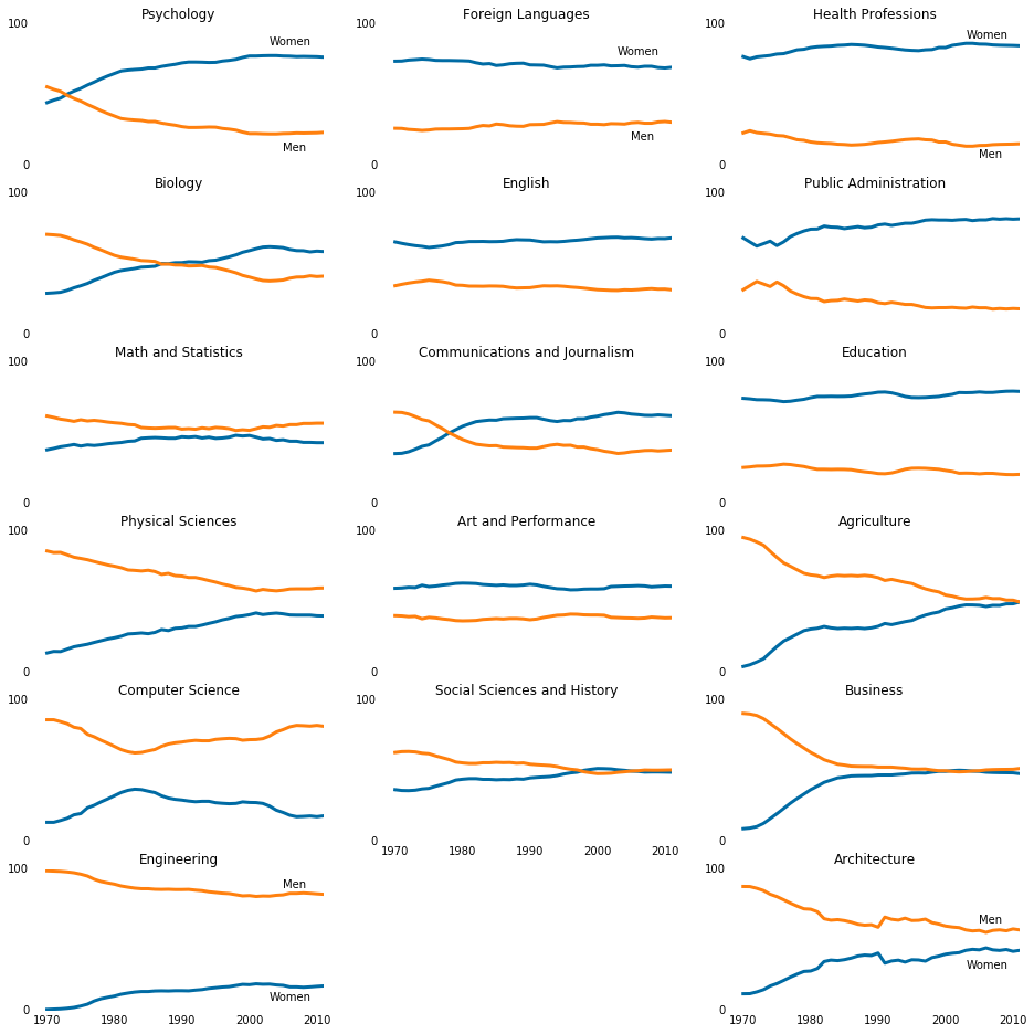
Adding a horizontal line to identify 50-50 gender breakdown
While removing most of the y-axis labels definitely reduced clutter, it also made it hard to understand which degrees have close to 50-50 gender breakdown. While keeping all of the y-axis labels would have made it easier, we can actually do one better and use a horizontal line across all of the line charts where the y-axis label 50 would have been.
fig = plt.figure(figsize=(16, 16))

## Generate first column of line charts. STEM degrees.
for sp in range(0,18,3):
    cat_index = int(sp/3)
    ax = fig.add_subplot(6,3,sp+1)
    ax.plot(women_degrees['Year'], women_degrees[stem_cats[cat_index]], c=cb_dark_blue, label='Women', linewidth=3)
    ax.plot(women_degrees['Year'], 100-women_degrees[stem_cats[cat_index]], c=cb_orange, label='Men', linewidth=3)
    for key,spine in ax.spines.items():
        spine.set_visible(False)
    ax.set_xlim(1968, 2011)
    ax.set_ylim(0,100)
    ax.set_title(stem_cats[cat_index])
    ax.tick_params(bottom="off", top="off", left="off", right="off", labelbottom='off')
    ax.set_yticks([0,100])
    ax.axhline(50, c=(171/255, 171/255, 171/255), alpha=0.3)

    if cat_index == 0:
        ax.text(2003, 85, 'Women')
        ax.text(2005, 10, 'Men')
    elif cat_index == 5:
        ax.text(2005, 87, 'Men')
        ax.text(2003, 7, 'Women')
        ax.tick_params(labelbottom='on')

## Generate second column of line charts. Liberal arts degrees.
for sp in range(1,16,3):
    cat_index = int((sp-1)/3)
    ax = fig.add_subplot(6,3,sp+1)
    ax.plot(women_degrees['Year'], women_degrees[lib_arts_cats[cat_index]], c=cb_dark_blue, label='Women', linewidth=3)
    ax.plot(women_degrees['Year'], 100-women_degrees[lib_arts_cats[cat_index]], c=cb_orange, label='Men', linewidth=3)
    for key,spine in ax.spines.items():
        spine.set_visible(False)
    ax.set_xlim(1968, 2011)
    ax.set_ylim(0,100)
    ax.set_title(lib_arts_cats[cat_index])
    ax.tick_params(bottom="off", top="off", left="off", right="off", labelbottom='off')
    ax.set_yticks([0,100])
    ax.axhline(50, c=(171/255, 171/255, 171/255), alpha=0.3)

    if cat_index == 0:
        ax.text(2003, 78, 'Women')
        ax.text(2005, 18, 'Men')
    elif cat_index == 4:
        ax.tick_params(labelbottom='on')

## Generate third column of line charts. Other degrees.
for sp in range(2,20,3):
    cat_index = int((sp-2)/3)
    ax = fig.add_subplot(6,3,sp+1)
    ax.plot(women_degrees['Year'], women_degrees[other_cats[cat_index]], c=cb_dark_blue, label='Women', linewidth=3)
    ax.plot(women_degrees['Year'], 100-women_degrees[other_cats[cat_index]], c=cb_orange, label='Men', linewidth=3)
    for key,spine in ax.spines.items():
        spine.set_visible(False)
    ax.set_xlim(1968, 2011)
    ax.set_ylim(0,100)
    ax.set_title(other_cats[cat_index])
    ax.tick_params(bottom="off", top="off", left="off", right="off", labelbottom='off')
    ax.set_yticks([0,100])
    ax.axhline(50, c=(171/255, 171/255, 171/255), alpha=0.3)

    if cat_index == 0:
        ax.text(2003, 90, 'Women')
        ax.text(2005, 5, 'Men')
    elif cat_index == 5:
        ax.text(2005, 62, 'Men')
        ax.text(2003, 30, 'Women')
        ax.tick_params(labelbottom='on')

plt.show()
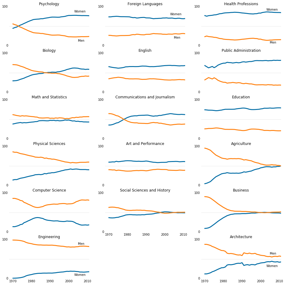
Exporting to a file
We will be Exporting the plots we created using matplotlib. It will allows us to use them in Word documents, Powerpoint presentations, and even in emails.
# Set backend to Agg.
fig = plt.figure(figsize=(16, 16))

## Generate first column of line charts. STEM degrees.
for sp in range(0,18,3):
    cat_index = int(sp/3)
    ax = fig.add_subplot(6,3,sp+1)
    ax.plot(women_degrees['Year'], women_degrees[stem_cats[cat_index]], c=cb_dark_blue, label='Women', linewidth=3)
    ax.plot(women_degrees['Year'], 100-women_degrees[stem_cats[cat_index]], c=cb_orange, label='Men', linewidth=3)
    for key,spine in ax.spines.items():
        spine.set_visible(False)
    ax.set_xlim(1968, 2011)
    ax.set_ylim(0,100)
    ax.set_title(stem_cats[cat_index])
    ax.tick_params(bottom="off", top="off", left="off", right="off", labelbottom='off')
    ax.axhline(50, c=(171/255, 171/255, 171/255), alpha=0.3)
    ax.set_yticks([0,100])

    if cat_index == 0:
        ax.text(2003, 85, 'Women')
        ax.text(2005, 10, 'Men')
    elif cat_index == 5:
        ax.text(2005, 87, 'Men')
        ax.text(2003, 7, 'Women')
        ax.tick_params(labelbottom='on')

## Generate second column of line charts. Liberal arts degrees.
for sp in range(1,16,3):
    cat_index = int((sp-1)/3)
    ax = fig.add_subplot(6,3,sp+1)
    ax.plot(women_degrees['Year'], women_degrees[lib_arts_cats[cat_index]], c=cb_dark_blue, label='Women', linewidth=3)
    ax.plot(women_degrees['Year'], 100-women_degrees[lib_arts_cats[cat_index]], c=cb_orange, label='Men', linewidth=3)
    for key,spine in ax.spines.items():
        spine.set_visible(False)
    ax.set_xlim(1968, 2011)
    ax.set_ylim(0,100)
    ax.set_title(lib_arts_cats[cat_index])
    ax.tick_params(bottom="off", top="off", left="off", right="off", labelbottom='off')
    ax.axhline(50, c=(171/255, 171/255, 171/255), alpha=0.3)
    ax.set_yticks([0,100])

    if cat_index == 0:
        ax.text(2003, 75, 'Women')
        ax.text(2005, 20, 'Men')
    elif cat_index == 4:
        ax.tick_params(labelbottom='on')

## Generate third column of line charts. Other degrees.
for sp in range(2,20,3):
    cat_index = int((sp-2)/3)
    ax = fig.add_subplot(6,3,sp+1)
    ax.plot(women_degrees['Year'], women_degrees[other_cats[cat_index]], c=cb_dark_blue, label='Women', linewidth=3)
    ax.plot(women_degrees['Year'], 100-women_degrees[other_cats[cat_index]], c=cb_orange, label='Men', linewidth=3)
    for key,spine in ax.spines.items():
        spine.set_visible(False)
    ax.set_xlim(1968, 2011)
    ax.set_ylim(0,100)
    ax.set_title(other_cats[cat_index])
    ax.tick_params(bottom="off", top="off", left="off", right="off", labelbottom='off')
    ax.axhline(50, c=(171/255, 171/255, 171/255), alpha=0.3)
    ax.set_yticks([0,100])

    if cat_index == 0:
        ax.text(2003, 90, 'Women')
        ax.text(2005, 5, 'Men')
    elif cat_index == 5:
        ax.text(2005, 62, 'Men')
        ax.text(2003, 30, 'Women')
        ax.tick_params(labelbottom='on')

# Export file before calling pyplot.show()
fig.savefig("gender_degrees.png")
plt.show()

Conclusion
From the above charts, we can draw a conclusion by saying that:
-
For STEM Degrees category,
Physical Sciencesdegrees have the gender gap reduced over time.Psychologybecame more popular amongWomenas a choice of college degree compare toMen. For other degrees, the gap remained almost similar in trend where the percentage of men is higher. -
For Liberal Arts Degrees, women seem to prefer them more.
Social Sciences and Historydegrees have the gender gap reduced over time. For other degrees, the gap remained almost similar in trend. -
For other categories Degrees, percentage of women is higher for
Health Profession,Public AdministrationandEducation.For the rest in this category degrees, the gender gap has reduced over time and the number of Women incrased.