

Data Science Project: Visualizing Earnings Based On College Majors
We’ll be working with a dataset on the job outcomes of students who graduated from college between 2010 and 2012. The original data on job outcomes was released by American Community Survey, which conducts surveys and aggregates the data. FiveThirtyEight cleaned the dataset and released it on their Github repo.
Each row in the dataset represents a different major in college and contains information on gender diversity, employment rates, median salaries, and more. Here are some of the columns in the dataset:
Rank- Rank by median earnings (the dataset is ordered by this column).Major_code - Major code.Major- Major description.Major_category- Category of major.Total- Total number of people with major.Sample_size- Sample size (unweighted) of full-time.Men- Male graduates.Women- Female graduates.ShareWomen- Women as share of total.Employed- Number employed.Median- Median salary of full-time, year-round workers.Low_wage_jobs- Number in low-wage service jobs.Full_time- Number employed 35 hours or more.Part_time- Number employed less than 35 hours.
Using visualizations, we will explore questions from the dataset like:
- Do students in more popular majors make more money?
- How many majors are predominantly male? Predominantly female?
- Which category of majors have the most students?
Data Preparation
We will setup the environment by importing the libraries we need, genarating summarry statistics for all the numeric columns, dropping the rows with missing values.
import pandas as pd
import matplotlib.pyplot as plt
%matplotlib inline

recent_grads = pd.read_csv('recent-grads.csv')
print(recent_grads.iloc[0])
print(recent_grads.head())
print(recent_grads.tail())
raw_data_count = len(recent_grads)
print(raw_data_count)
recent_grads = recent_grads.dropna()
cleaned_data_count = len(recent_grads)
print(cleaned_data_count)
Rank                                        1
Major_code                               2419
Major                   PETROLEUM ENGINEERING
Total                                    2339
Men                                      2057
Women                                     282
Major_category                    Engineering
ShareWomen                           0.120564
Sample_size                                36
Employed                                 1976
Full_time                                1849
Part_time                                 270
Full_time_year_round                     1207
Unemployed                                 37
Unemployment_rate                   0.0183805
Median                                 110000
P25th                                   95000
P75th                                  125000
College_jobs                             1534
Non_college_jobs                          364
Low_wage_jobs                             193
Name: 0, dtype: object
   Rank  Major_code                                      Major    Total  \
0     1        2419                      PETROLEUM ENGINEERING   2339.0
1     2        2416             MINING AND MINERAL ENGINEERING    756.0
2     3        2415                  METALLURGICAL ENGINEERING    856.0
3     4        2417  NAVAL ARCHITECTURE AND MARINE ENGINEERING   1258.0
4     5        2405                       CHEMICAL ENGINEERING  32260.0

       Men    Women Major_category  ShareWomen  Sample_size  Employed  \
0   2057.0    282.0    Engineering    0.120564           36      1976
1    679.0     77.0    Engineering    0.101852            7       640
2    725.0    131.0    Engineering    0.153037            3       648
3   1123.0    135.0    Engineering    0.107313           16       758
4  21239.0  11021.0    Engineering    0.341631          289     25694

       ...        Part_time  Full_time_year_round  Unemployed  \
0      ...              270                  1207          37
1      ...              170                   388          85
2      ...              133                   340          16
3      ...              150                   692          40
4      ...             5180                 16697        1672

   Unemployment_rate  Median  P25th   P75th  College_jobs  Non_college_jobs  \
0           0.018381  110000  95000  125000          1534               364
1           0.117241   75000  55000   90000           350               257
2           0.024096   73000  50000  105000           456               176
3           0.050125   70000  43000   80000           529               102
4           0.061098   65000  50000   75000         18314              4440

   Low_wage_jobs
0            193
1             50
2              0
3              0
4            972

[5 rows x 21 columns]
     Rank  Major_code                   Major   Total     Men   Women  \
168   169        3609                 ZOOLOGY  8409.0  3050.0  5359.0
169   170        5201  EDUCATIONAL PSYCHOLOGY  2854.0   522.0  2332.0
170   171        5202     CLINICAL PSYCHOLOGY  2838.0   568.0  2270.0
171   172        5203   COUNSELING PSYCHOLOGY  4626.0   931.0  3695.0
172   173        3501         LIBRARY SCIENCE  1098.0   134.0   964.0

               Major_category  ShareWomen  Sample_size  Employed  \
168    Biology & Life Science    0.637293           47      6259
169  Psychology & Social Work    0.817099            7      2125
170  Psychology & Social Work    0.799859           13      2101
171  Psychology & Social Work    0.798746           21      3777
172                 Education    0.877960            2       742

         ...        Part_time  Full_time_year_round  Unemployed  \
168      ...             2190                  3602         304
169      ...              572                  1211         148
170      ...              648                  1293         368
171      ...              965                  2738         214
172      ...              237                   410          87

     Unemployment_rate  Median  P25th  P75th  College_jobs  Non_college_jobs  \
168           0.046320   26000  20000  39000          2771              2947
169           0.065112   25000  24000  34000          1488               615
170           0.149048   25000  25000  40000           986               870
171           0.053621   23400  19200  26000          2403              1245
172           0.104946   22000  20000  22000           288               338

     Low_wage_jobs
168            743
169             82
170            622
171            308
172            192

[5 rows x 21 columns]
173
172
When we compare the cleaned_data_count and raw_data_count, it has been noticed that only one row contained missing values and it was dropped.
Data Visualisation using Pandas,Scatter Plots
We will generate scatter plots in separate cells to explore the following relations:
Sample_sizeandMedianSample_sizeandUnemployment_rateFull_timeandMedianShareWomenandUnemployment_rateMenandMedianWomenandMedian
After that, using the plots, we will explore the following questions:
- Do students in more popular majors make more money?
- Do students that majored in subjects that were majority female make more money?
- Is there any link between the number of full-time employees and median salary?
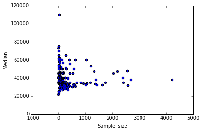
recent_grads.plot(x='Sample_size', y='Median', kind='scatter')
<matplotlib.axes._subplots.AxesSubplot at 0x7fb770cb0748>
recent_grads.plot(x='Sample_size', y='Unemployment_rate', kind='scatter')
<matplotlib.axes._subplots.AxesSubplot at 0x7fb7263636a0>
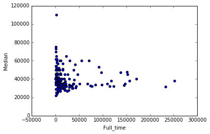
recent_grads.plot(x='Full_time', y='Median', kind='scatter')
<matplotlib.axes._subplots.AxesSubplot at 0x7fb7262d8da0>
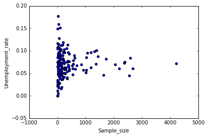
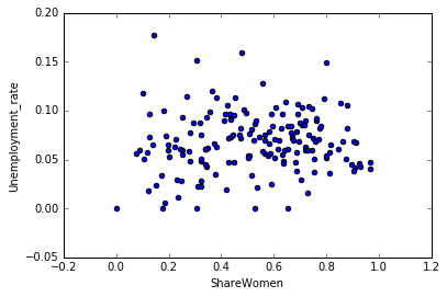
recent_grads.plot(x='ShareWomen', y='Unemployment_rate', kind='scatter')
<matplotlib.axes._subplots.AxesSubplot at 0x7fb7263845c0>
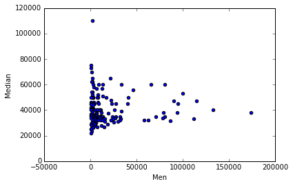
recent_grads.plot(x='Men', y='Median', kind='scatter')
<matplotlib.axes._subplots.AxesSubplot at 0x7fb726222a58>
recent_grads.plot(x='Women', y='Median', kind='scatter')
<matplotlib.axes._subplots.AxesSubplot at 0x7fb726209160>
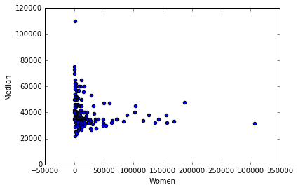
From the scattered plot above, it can be observed that students in more popular majors earn wages between 30k to 40k. Again, subjects with female majority make less money than others. With the increase of number of full time employees, median salary averaged between 30k to 40k. But it can be predicted that companies with small number of full time emplyees tend to pay higher median salary.
Data Visualisation with Pandas and Histograms
We will generate histograms to explore the distributions of the following columns:
Sample_sizeMedianEmployedFull_timeShareWomenUnemployment_rateMenWomen
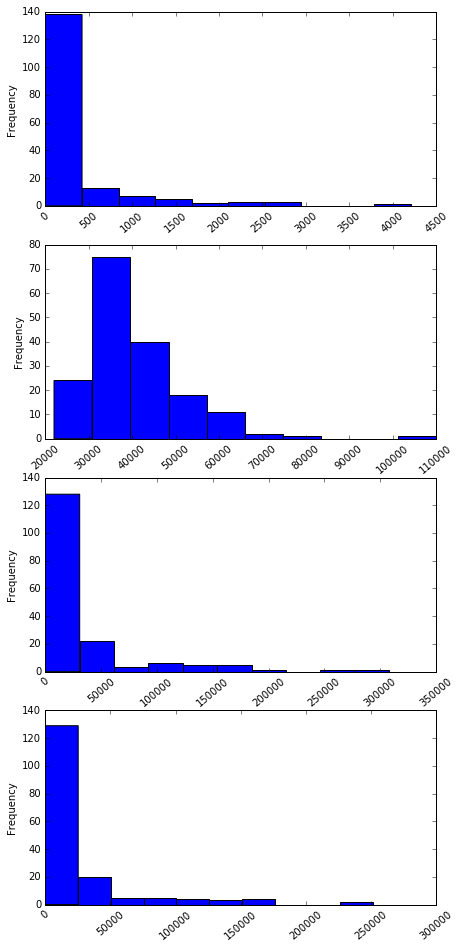
cols = ["Sample_size", "Median", "Employed", "Full_time", "ShareWomen", "Unemployment_rate", "Men", "Women"]
fig = plt.figure(figsize = (7,16))
for r in range(4):
    ax = fig.add_subplot(4,1, r+1)
    ax = recent_grads[cols[r]].plot(kind = 'hist', rot = 40)
cols = ["Sample_size", "Median", "Employed", "Full_time", "ShareWomen", "Unemployment_rate", "Men", "Women"]

fig = plt.figure(figsize=(7,14))
for r in range(4,8):
    ax = fig.add_subplot(4,1,r-3)
    ax = recent_grads[cols[r]].plot(kind='hist', rot=40)
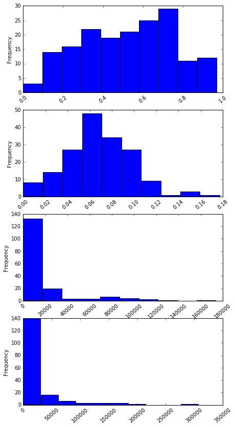
The most common median salary range is between 22000 to 45000. Almost 40% of majors are predminant by Wome(60% share women rate). Again, around 30% of majors are male predominant (with share women rate of 40%).
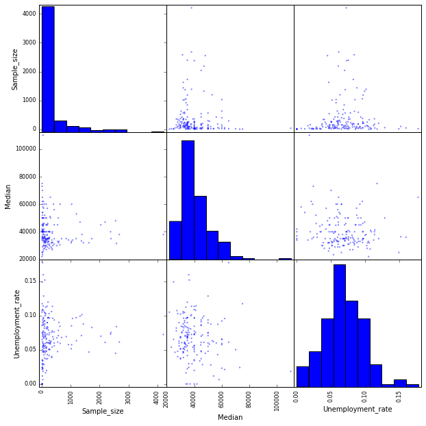
Visualisation with Pandas and Scatter Matrix Plot
In the last 2 steps, we created individual scatter plots to visualize potential relationships between columns and histograms to visualize the distributions of individual columns. A scatter matrix plot combines both scatter plots and histograms into one grid of plots and will allow us to explore potential relationships and distributions simultaneously.
from pandas.plotting import scatter_matrix
scatter_matrix(recent_grads[['Sample_size', 'Median']], figsize=(6,6))
array([[<matplotlib.axes._subplots.AxesSubplot object at 0x7fb726074940>,
        <matplotlib.axes._subplots.AxesSubplot object at 0x7fb725f2bbe0>],
       [<matplotlib.axes._subplots.AxesSubplot object at 0x7fb726041ef0>,
        <matplotlib.axes._subplots.AxesSubplot object at 0x7fb725f53940>]],
      dtype=object)
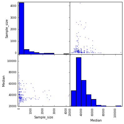
scatter_matrix(recent_grads[['Sample_size', 'Median', 'Unemployment_rate']], figsize=(10,10))
array([[<matplotlib.axes._subplots.AxesSubplot object at 0x7fb725f49828>,
        <matplotlib.axes._subplots.AxesSubplot object at 0x7fb725de57b8>,
        <matplotlib.axes._subplots.AxesSubplot object at 0x7fb725ec7160>],
       [<matplotlib.axes._subplots.AxesSubplot object at 0x7fb725eee470>,
        <matplotlib.axes._subplots.AxesSubplot object at 0x7fb725e77f28>,
        <matplotlib.axes._subplots.AxesSubplot object at 0x7fb725a05f98>],
       [<matplotlib.axes._subplots.AxesSubplot object at 0x7fb7259d4ba8>,
        <matplotlib.axes._subplots.AxesSubplot object at 0x7fb725991be0>,
        <matplotlib.axes._subplots.AxesSubplot object at 0x7fb7258d8d30>]],
      dtype=object)
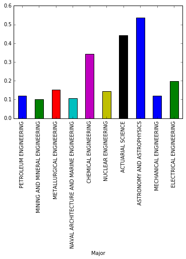
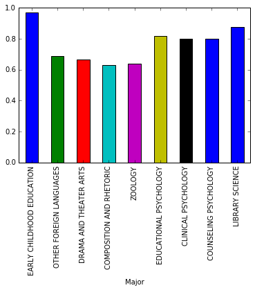
Visualisation with Pandas and Bar Plots
We will use bar plots to compare the percentages of women (ShareWomen) from the first ten rows and last ten rows of the recent_grads dataframe. Also, to compare the unemployment rate (Unemployment_rate) from the first ten rows and last ten rows of the recent_grads dataframe.
recent_grads[:10].plot.bar(x='Major', y='ShareWomen', legend=False)
recent_grads[163:].plot.bar(x='Major', y='ShareWomen', legend=False)
<matplotlib.axes._subplots.AxesSubplot at 0x7fb725cfea20>
Conclusion
Women are tend to prefer majors from Psychology and Social Work departments. The median salary range of these subjects are categorized as low wages.